Dezeen · Creativity & design
Andersson Bell Tokyo Store Features Contrasting Concrete and Bright Colors
Japanese studio I IN has designed the flagship store for fashion brand Andersson Bell in Tokyo, utilizing the building's original exposed concrete architecture as a backdrop for vibrant, contrasting colors and glossy finishes.
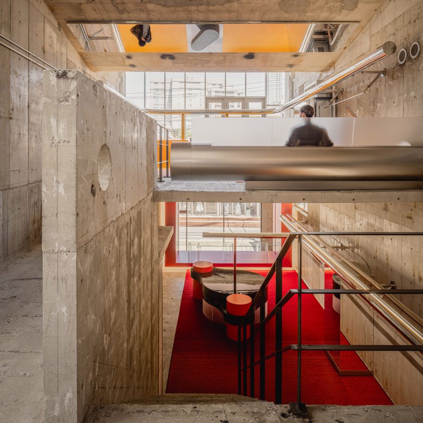
Located in Tokyo's Aoyama neighborhood, the store's design was heavily influenced by the 1993 building's raw, brutalist concrete interior. I IN aimed to translate the brand's identity of 'contrast' into the spatial design, introducing a modern layer that complements rather than competes with the existing architecture.
The studio introduced warm, saturated colors across the store's three floors. Bright red, orange, and yellow hues are used to contrast against the board-marked concrete walls. The red, the brand's signature color, is prominent on the entrance level, with a gradual transition to orange and then yellow on the upper floors, creating a distinct atmosphere and sense of progression.
Additional elements like steel pipes were added to "pierce" the existing structure, further emphasizing the contrast. I IN juxtaposed the concrete's raw tactility with glossy and mirrored details, including a glass floor, steel pipes, and lacquered display cases and tables.
All furniture within the 309-square-meter store was custom-made by I IN. The furniture was designed to feel like an integral part of the architecture, drawing inspiration from its powerful character and scale, aiming to merge seamlessly with the space.
AI-samenvatting op basis van de bron.
Dezeen